Design review on the thing you actually shipped
SnapShelf is a $49 one-time macOS 13+ app for design review: capture the built UI, mark it up with arrows, text, and callouts in a native editor, and export a whole review round as one multi-page PDF — all stored locally.
Last updated
The annotation editor with numbered step badges, arrows, and a blurred region over customer data on a staging screen.
Figma comments are excellent, and they stop at the file boundary
Commenting inside Figma is close to perfect for reviewing a design. The comment is pinned to a frame, it has a thread, it resolves, and everyone sees the same coordinates. Nobody should try to replace that.
The reviews that go badly are the ones about the built product. The frame said 24px of padding; the staging build has 16px and a font that falls back on Windows. That comparison does not live in Figma, because half of it is a browser window on someone’s laptop. So it degrades into a Slack thread with four screenshots, three of which have no context, and a message that says "the spacing feels off on the card, second one from the left".
That is the round SnapShelf is for: feedback on the implementation, delivered with enough precision that the engineer does not have to guess which card you meant.
Precision beats prose in visual feedback
A design note has to answer three questions: which element, what is wrong, what should it be. Prose answers the second one well and the first one badly. An arrow answers the first one instantly.
The annotation editor covers the tools this actually needs — twelve of them, including arrows, lines, rectangles and ellipses, freehand pen, highlighter, text, crop, blur for anything confidential, step-number badges when the feedback is sequential, and adjustable colour and stroke so your marks are legible against whatever the UI happens to be. Marking up a screen takes about the same time as typing the sentence describing it, and the result is unambiguous.
The step badges matter more than they sound. Numbering your marks 1–6 on a single screenshot turns a wall of arrows into a list the engineer can work through and tick off. It also means the written note becomes six short lines instead of six paragraphs of spatial description.
Batching a review round into one document
Sending eight separate annotated screenshots into a Slack thread guarantees that three of them get lost above the fold. Batching the round into a single PDF gives it a shape — the reviewer works through it in order, and the artefact still exists next month when someone asks what was agreed.
- 1Capture each screen you are reviewing — window capture gets the frame cleanly with the standard macOS drop shadow
- 2Annotate each one, numbering your marks with step badges so the written notes can reference them
- 3Select the whole set in the gallery and choose Export → PDF
- 4Reorder the pages so the document follows the user flow rather than the order you captured in
- 5Attach the PDF to the review ticket, or drop it in the channel as one file instead of eight
Making a screenshot presentable when the audience is not the engineer
Internal review markup should look like markup. But the same capture often has a second life — in a stakeholder deck, a release note, or a post — and a raw window grab reads as scrappy in those contexts.
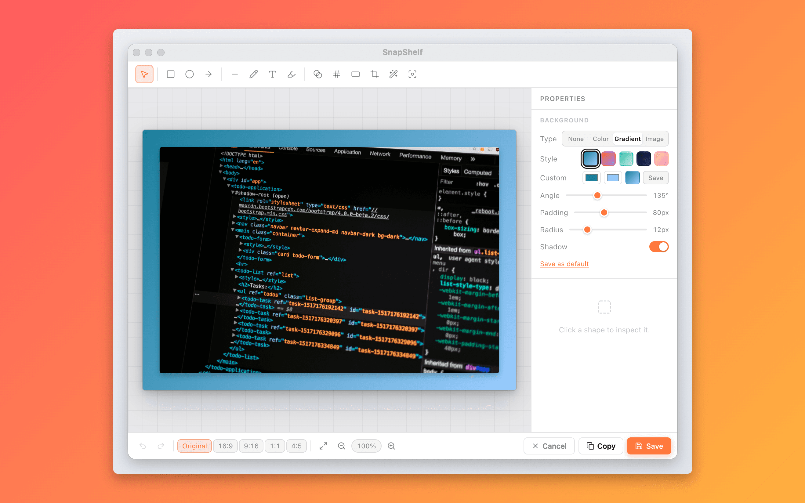
The background editor wraps a capture in a solid colour, gradient, or your own image, with configurable padding, rounded corners, and a drop shadow. It is the Xnapper trick, and it takes about fifteen seconds. Do not do it for the working review — it wastes your time and makes the marks harder to read — but do it for anything leaving the team.
Where this is the wrong tool
It has no relationship with your Figma file. There is no overlay diff, no pixel-comparison against a frame, no measurement of what the build is doing versus what the design specified. You are eyeballing it, the same as you were before, just with better markup. Shottr has pixel-measurement tools if that is the part you need.
It has no comment threads, no resolve state, and no notion of who owes a reply. A PDF in a ticket is a snapshot of one round, not a system of record. Your tracker still has to carry the conversation.
And there are no share links. A review round goes out as a file, not a URL, because SnapShelf keeps everything on your Mac by default. For a lot of client and confidential work that is the point, but it does mean an extra attachment step.
Try SnapShelf
$49 once — 2 years of free updates, no subscription, and everything stays on your Mac. 30-day money-back guarantee.
macOS 13+ · Apple Silicon & Intel
FAQ
Questions, answered
Everything you need to know before buying.
macOS Markup, reachable from the screenshot thumbnail preview, handles arrows and text and is free. It has no blur redaction, no step-number badges, no reusable colour and stroke settings, and no gallery of past captures. SnapShelf adds those and keeps every annotated capture searchable afterwards. What the annotation editor includes →
Stop hunting for screenshots. Start shipping.
Every capture filed, annotated, recorded with cursor auto-zoom, and one right-click away from your Claude Code session. One-time $49, yours forever.
30-day money-back guaranteeOne-time purchase2 years of free updatesLocal-only datamacOS 13+ · Apple Silicon & Intel