How to take screenshots for documentation
Good documentation screenshots are consistent above all: capture at a fixed window size, crop to the smallest region that still gives context, export at 2x for retina displays, and use numbered step badges rather than arrows for multi-step figures.
Last updated
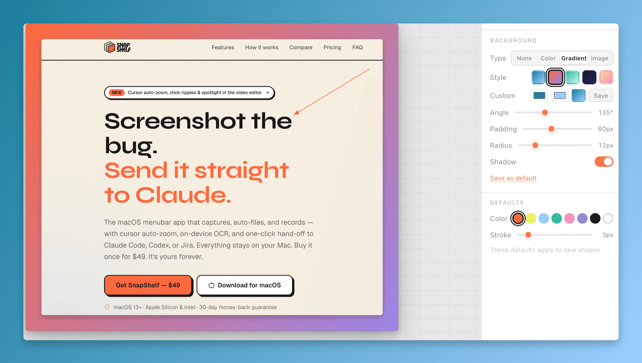
A documentation screenshot in the SnapShelf editor with numbered step badges and consistent padding applied.
Consistency matters more than any individual screenshot
A reader does not evaluate your screenshots one at a time. They scroll a page, and they form an impression from the set. Twelve screenshots at twelve different widths, some with a browser chrome and some without, some in light mode and some in dark, read as careless even when every individual image is sharp and correct.
The same twelve at an identical width, cropped the same way, with the same annotation colour, read as deliberate — and the reader stops noticing the screenshots and starts reading the documentation. That is the goal. A good documentation screenshot is invisible.
So decide the rules once, write them down, and apply them mechanically. Window width. Light or dark mode. Browser chrome in or out. Annotation colour. Whether the cursor appears. Corner radius and shadow. None of these decisions is individually important and every one of them is important to have made.
One specific rule saves more rework than the rest combined: pick a single window size and capture everything at it. Something in the region of 1280×800 is a sensible default — wide enough for real layouts, narrow enough that text stays legible when the image is scaled down into a docs column. Resize the window once with a window manager and leave it there for the whole session.
Retina scaling, and why your screenshots look blurry
This is the most common technical mistake in documentation screenshots and it has a precise cause.
A Retina Mac captures at 2x. Take a screenshot of a 1280×800 window and the PNG is 2560×1600 pixels. That is correct and desirable — the extra pixels are what makes text look sharp on a high-DPI display.
The mistake is resizing that file down to 1280 wide before putting it in the docs, usually to save bandwidth. On a standard display it looks fine. On the Retina or high-DPI display that most of your readers are using, it is being upscaled back to 2x and it looks soft, exactly like an image that has been through a photocopier.
Keep the 2x file and let the page display it at half its pixel width — via CSS, a width attribute, or your docs framework’s image handling. The image is then pixel-dense enough for high-DPI screens and correctly sized on standard ones.
If the file size is genuinely a problem, compress rather than downscale. PNG through a quantiser like pngquant, or WebP at high quality, typically cuts a UI screenshot by 60–80% with no visible difference, because flat UI colours compress extremely well. Downscaling destroys information permanently; compression mostly does not.
One more thing that costs nothing: capture at a fixed display scaling and do not change it mid-project. Switching between Default and More Space in System Settings → Displays changes the effective pixel dimensions of every subsequent capture, and a docs set captured across both will never line up.
Framing: show the least that still makes sense
The instinct is to capture the whole screen so the reader has full context. It is the wrong instinct. A full-screen capture scaled into a documentation column makes the button you are describing about eight pixels tall.
Crop to the smallest region that still lets the reader locate themselves. In practice that usually means the relevant panel plus one recognisable anchor — a section heading, a sidebar item, a tab label. Enough to answer "where am I?" and nothing more.
Capture a single window rather than a region wherever you can. On macOS, ⌘⇧4 then Space captures a window cleanly, with correct corners and transparency. Hold Option while clicking to drop the shadow, which otherwise adds substantial transparent padding that will fight with your page layout.
Keep your own environment out of the frame. The macOS menu bar carries your account name, the time, and whatever menu bar apps you run — none of which belong in someone else’s documentation, and all of which date the screenshot. Browser chrome brings your bookmarks bar and your other tabs. Crop them out, or capture the window rather than the screen.
Use realistic data, not placeholder text. A screenshot full of "Test test", "asdf", and "User 1" undermines the documentation more than a slightly imperfect crop. Keep a demo account populated with plausible, non-sensitive content and take every screenshot in it. This also means you never have to redact anything, which removes an entire category of risk — a screenshot with a real customer name in it is a disclosure waiting to happen.
And decide about the cursor deliberately. Including it draws the eye toward the element being discussed, but it also introduces an inconsistency the moment one screenshot has it and the next does not. Pick one and stick with it; ⌘⇧5 → Options → Show Mouse Pointer controls it.
Annotation: when to use step badges instead of arrows
The rule is simpler than most style guides make it. One thing to point at, use an arrow or a box. More than one thing, or things that happen in an order, use numbered step badges.
Arrows are directional and unordered. Three arrows in one image give the reader no indication of which to look at first, so their eye picks arbitrarily and they have to reconstruct the sequence from your body text. Numbered badges encode the order into the image itself, and the reader can follow 1, 2, 3 without reading a word.
This is why badges are the right default for any multi-step procedure in a single figure. It also lets your prose reference them directly — "click Save (3)" is unambiguous in a way that "click the Save button indicated by the arrow" is not.
A few conventions worth adopting wholesale. Use one annotation colour throughout the documentation set, and make it a colour that does not appear in the product UI — if your app is blue, do not annotate in blue. Use a consistent stroke weight; thin lines vanish when the image is scaled down. Prefer a box around a region over an arrow pointing at it when the target is a UI element with clear edges, since a box shows extent as well as position. Never annotate with text inside the image if that text could live in the caption instead — text baked into a screenshot cannot be translated, cannot be searched, and cannot be read by a screen reader.
Blur deserves a specific warning. If you are covering credentials or personal data rather than just de-emphasising a region, use a solid opaque box, not a blur — blur and pixelation can sometimes be reversed. There is a separate guide on this and it is worth reading before you publish anything containing a token.
SnapShelf’s annotation editor has twelve tools — select, rectangle, ellipse, arrow, line, pen, text, highlighter, blur, step badges, button, and crop — with colour and stroke controls, so a whole docs set can share one visual language without hand-managing styles in a design tool. There are also two one-click actions worth knowing about for docs imagery, Remove Background and Background Blur, which lift the subject using the Vision framework and need macOS 14 or later; the buttons are hidden if it is unavailable.
- 1Set the app window to your standard size before capturing anything
- 2Capture the window with ⌘⇧4 then Space, holding Option to omit the drop shadow
- 3Crop to the smallest region that still shows a recognisable anchor
- 4Add numbered step badges in sequence if the figure shows more than one action
- 5Cover any credential or personal data with a solid opaque box, never a blur
- 6Export at 2x and let the page display it at half width
- 7Write real alt text describing what is in the frame, not "screenshot of the app"
Keeping a documentation screenshot set maintainable
Screenshots rot. The product ships a redesign, and every image in your documentation is now subtly wrong — and nothing tells you, because an outdated screenshot renders perfectly well.
A few habits keep the cost down. Take fewer screenshots. Every image is a maintenance liability, and a lot of documentation includes a screenshot of a form with three fields where a sentence would have been clearer and would never go stale. Screenshot the things that are hard to describe in words: spatial layouts, visual states, anything where "you will know it when you see it" applies.
Keep the source captures, not just the annotated exports. When the UI changes you want to re-capture and re-annotate, not reverse-engineer the crop and badge positions from a flattened PNG.
Name and file them predictably. A folder of Screenshot 2026-07-14 at 11.32.08.png is unusable six months later. Name by what the image shows and where it is used — settings-notifications-01.png beats any timestamp. SnapShelf’s auto-filing can route captures into a project folder automatically based on the frontmost app and window title, which is the same problem solved at capture time instead of cleanup time — though no rules ship by default, so it does nothing until you write one.
And group each documentation page’s screenshots in one place so that a UI change means re-capturing one folder rather than hunting through a repository. Ten minutes of structure at the start saves an afternoon at every redesign.
Try SnapShelf
$49 once — 2 years of free updates, no subscription, and everything stays on your Mac. 30-day money-back guarantee.
macOS 13+ · Apple Silicon & Intel
FAQ
Questions, answered
Everything you need to know before buying.
Capture at a consistent window size — around 1280×800 works well — and export at 2x, so the file is roughly 2560×1600 on a Retina Mac. Display it at half its pixel width in the page. Consistency across the set matters more than the specific number you choose.
Stop hunting for screenshots. Start shipping.
Every capture filed, annotated, recorded with cursor auto-zoom, and one right-click away from your Claude Code session. One-time $49, yours forever.
30-day money-back guaranteeOne-time purchase2 years of free updatesLocal-only datamacOS 13+ · Apple Silicon & Intel